Cleveland Flea
Cleveland’s seasonal market connecting independent makers and curators to a city that loves them.
Founder, Stephanie Sheldon, had found instant success. Her baby—a large-scale community shopping event featuring local goods—had grown from budding regional start-up to a nationally-recognized event. She had created something special and sought our help in buttoning-up the organically-grown brand.
After years of experimentation, the Cleveland Flea was finding day-to-day management of their visual identity fussy. Their communications in print and on-screen craved cohesiveness and our role was to make it simple.
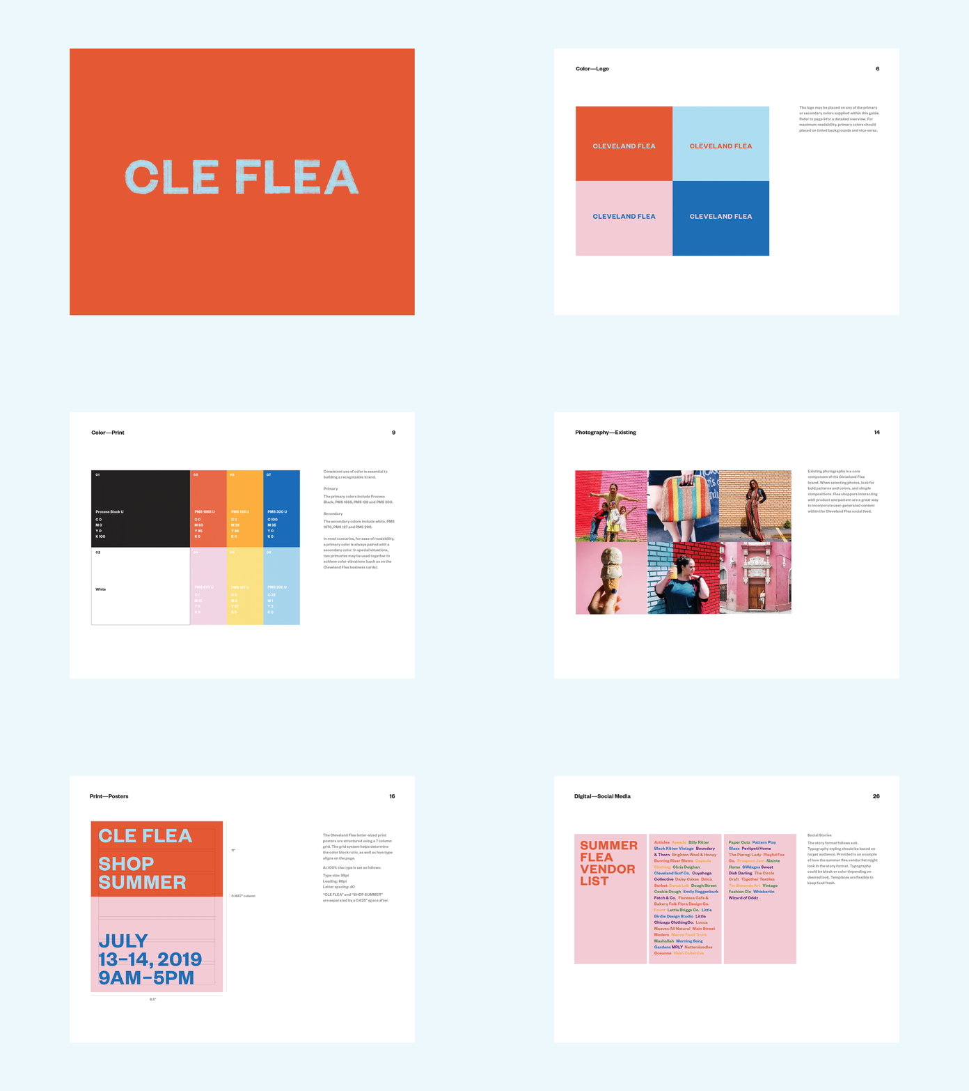
We began with auditing the current materials and plotted opportunities for improvement. We refreshed the Flea’s logo, typography and color palette. We took inspiration from the Flea's color blocked public art and revamped the seasonal market promotions to follow suit.
We studied their social feed and proposed a refreshed mix of post styles. We considered various brand voices, use of existing photography, the inclusion of new styled photography, inspirational messaging and typographic expression. We delivered a style guide for staff to use as their new foundation, guiding day-to-day implementation.
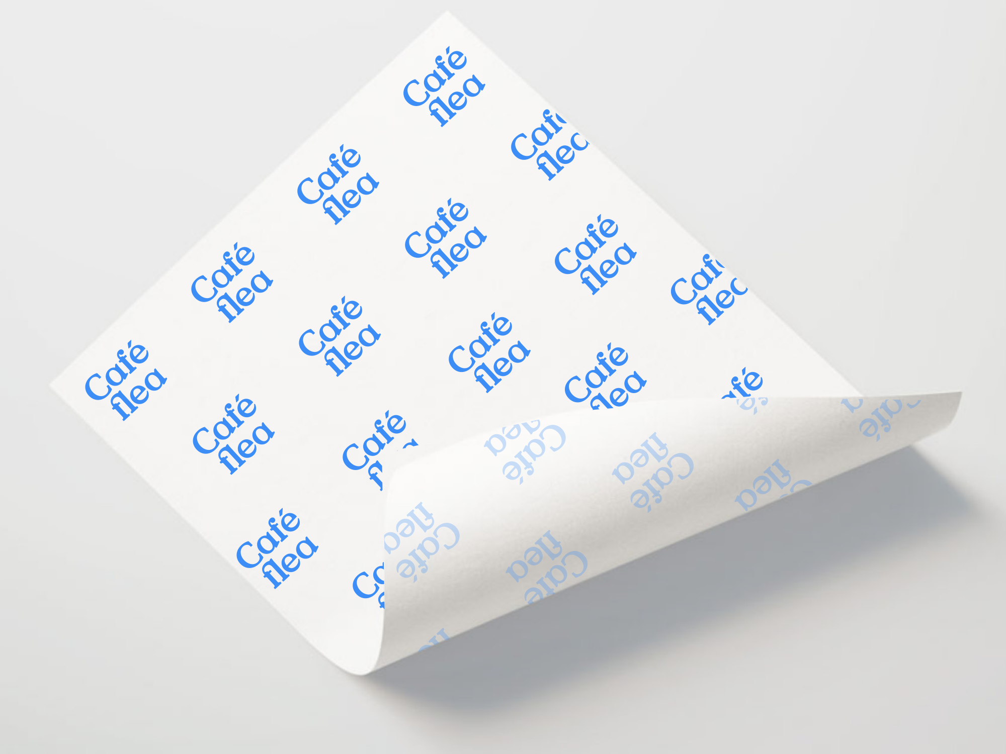
We renamed and branded Café Flea—a product of the creative market. Inspired by the founder’s love of European cafés and Wes Anderson, we developed a nostalgic identity including logo and assigned supporting type, whimsical color palette and classic pattern.
The personality of this brand was already thriving, our role was to discover those special moments and deliver them to the staff in a simplified manner to use daily.
Photography
The Cleveland Flea
Services
Strategy
Identity
Collateral
Art Direction
Social Media


