Quarter
194 intimate apartments with thoughtful layouts nestled in Cleveland's historic Ohio City neighborhood.
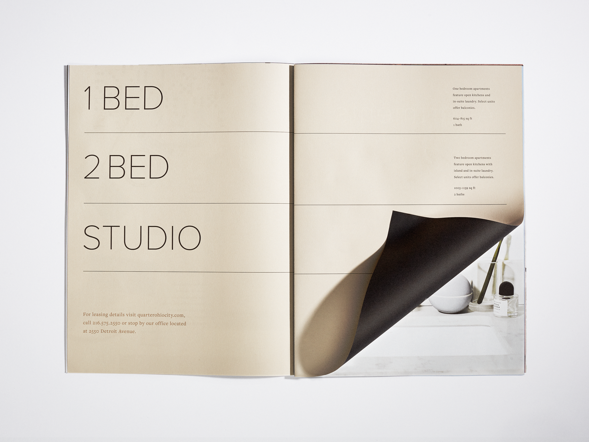
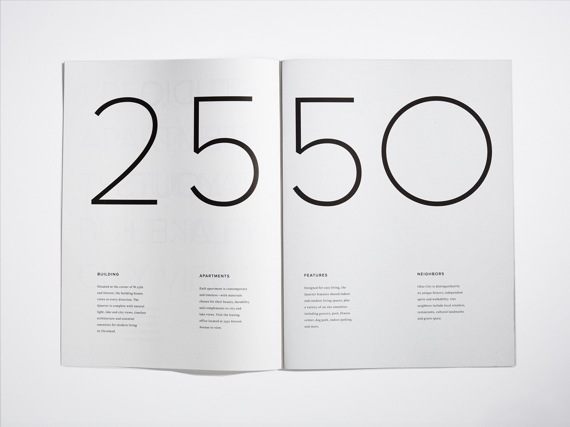
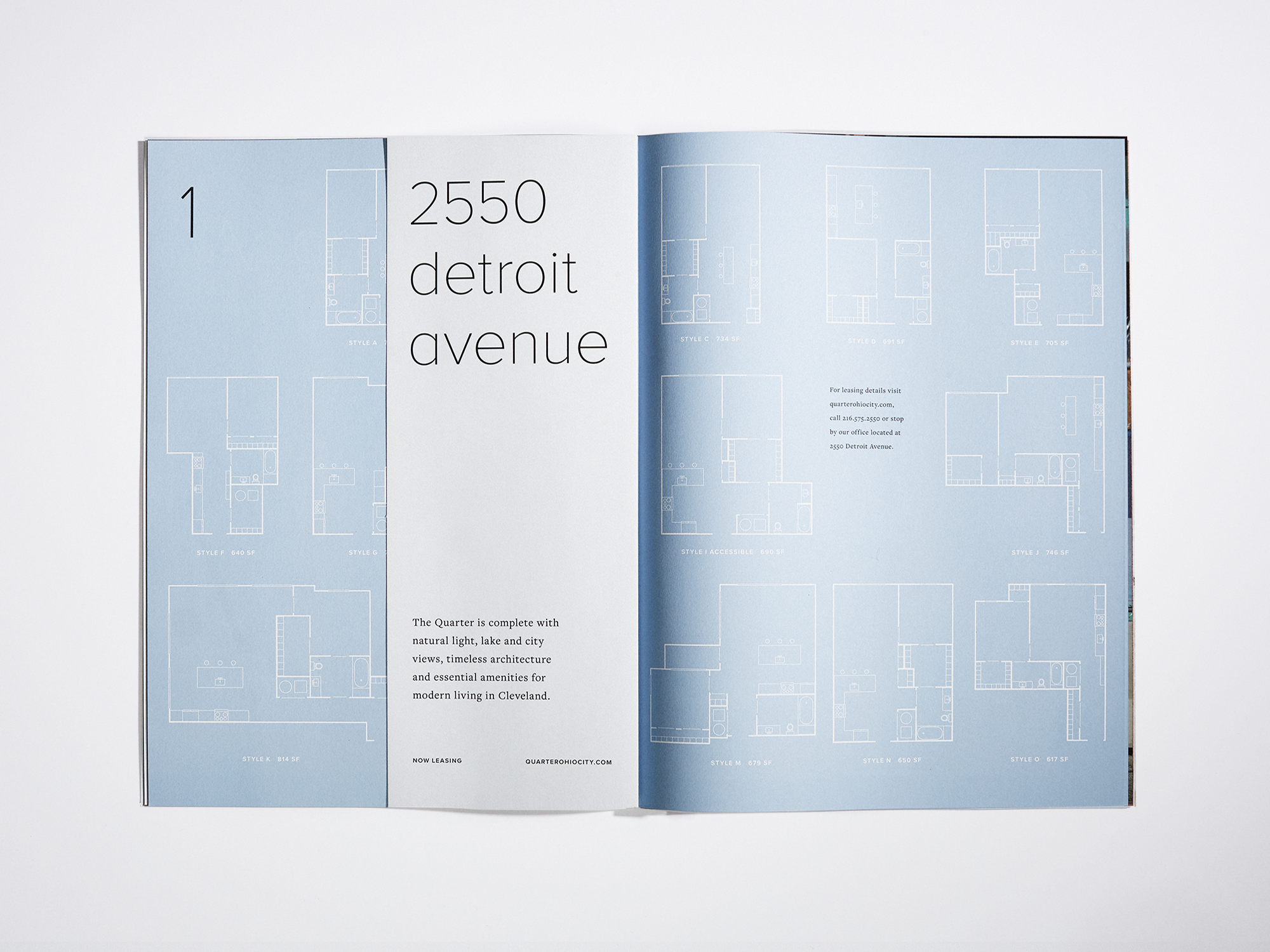
Three years prior to open, we began working with Quarter's creators to name, position and identify their considered apartment building with lake and city views. The process began with a demographic study that went on to inspire messaging, stationery, brochure, photography, website, interiors, temporary signage and leasing office.
Beginning with name, we looked for a word that defined the purpose as well as the place. Quarter was all of those things. We built a logo that worked as both a word and a monogram. We produced a system of communication pieces that reflected the Quarter's intentional design. We sat in on meetings with architects and interior designers, we shared inspiration and a vision for a timeless welcoming space.
In addition to branding the building, we established a pre-open personality for promotional materials, temporary leasing office, construction hoarding and social media. This voice was colorful, bold and a little bit whimsical—just like the neighborhood in which this happy modern retreat calls home.
Services
Strategy
Naming
Identity
Collateral
Art Direction
Photography
Web Design
Signage
Advertising
Copywriting
Product
Social Media


